Web dashboard and JSON API
adacovex --target=. --serve --port=8080 runs the full assessment and then
starts a built-in HTTP/1.1 server (no external web stack) that serves a
viewable HTML dashboard plus a machine-readable JSON API and the SVG
badges. The server blocks until interrupted – run it in its own terminal, or
as a background process when scripting.
adacovex --target=. --serve --port=8080
# in another terminal:
curl http://localhost:8080/api/metrics
How to use the dashboard
Open http://localhost:8080 in a browser. The page is a single self-contained
document (no external assets) with hash-routed tabs. Use the header dropdown to
switch themes (light / dark / system) and Save settings to persist your
choice.
Overview tab
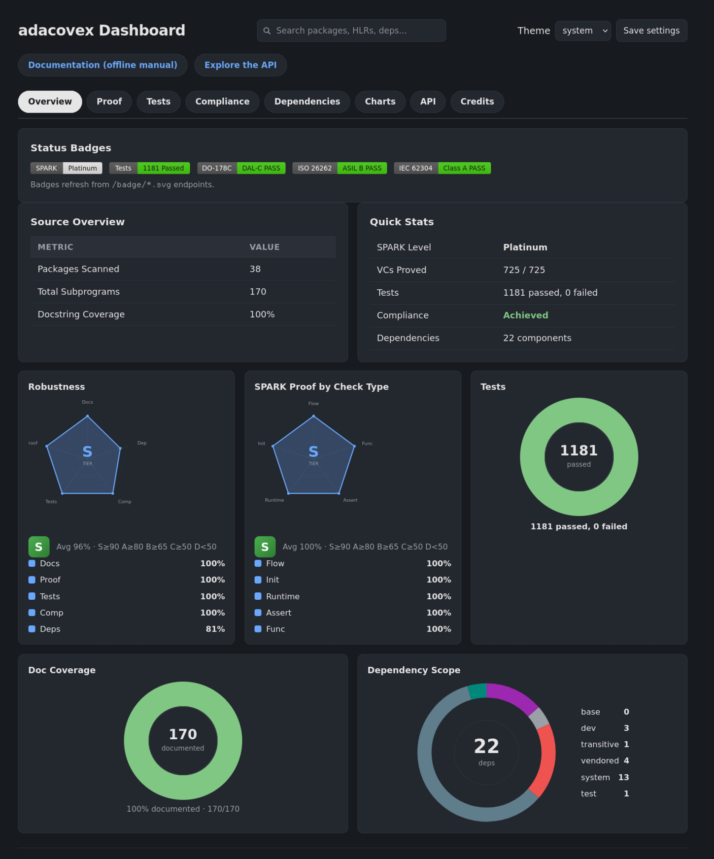
Start here. The Robustness tier (S / A / B / C / D) is a single letter that summarises five quality axes: Docs, Proof, Tests, Compliance, and Deps. An S means the project is healthy across the board. A D means one or more axes are below 50%. Below that:
SPARK radar – proved verification conditions per check category (flow, initialization, runtime, assertions, functional). A balanced polygon means every category has strong coverage. A spike in one corner and a flat line in another means the proof effort is uneven.
Tests donut – passed vs failed tests. A full green arc means 100% passing. Any red slice means the test suite has failures that must be fixed before the project can be assessed as
Achieved.Doc coverage donut – documented subprograms as a percentage of total. Strict mode requires 100%. A shortfall here shows exactly how many subprograms are missing
--docstrings.Dependency scope ring – the resolved graph broken down by scope (base / dev / transitive / vendored / system / test). It sits in the same row as the doc-coverage donut so the Overview uses its width well. Each coloured segment is hoverable: hovering shows the scope name and its component count (for example
test: 3).
Proof check bars scale with the category’s magnitude, the same way as the test-category bars: a 407-VC category reads as a longer bar than a 56-VC one, so relative proof effort is visible at a glance.
Proof tab
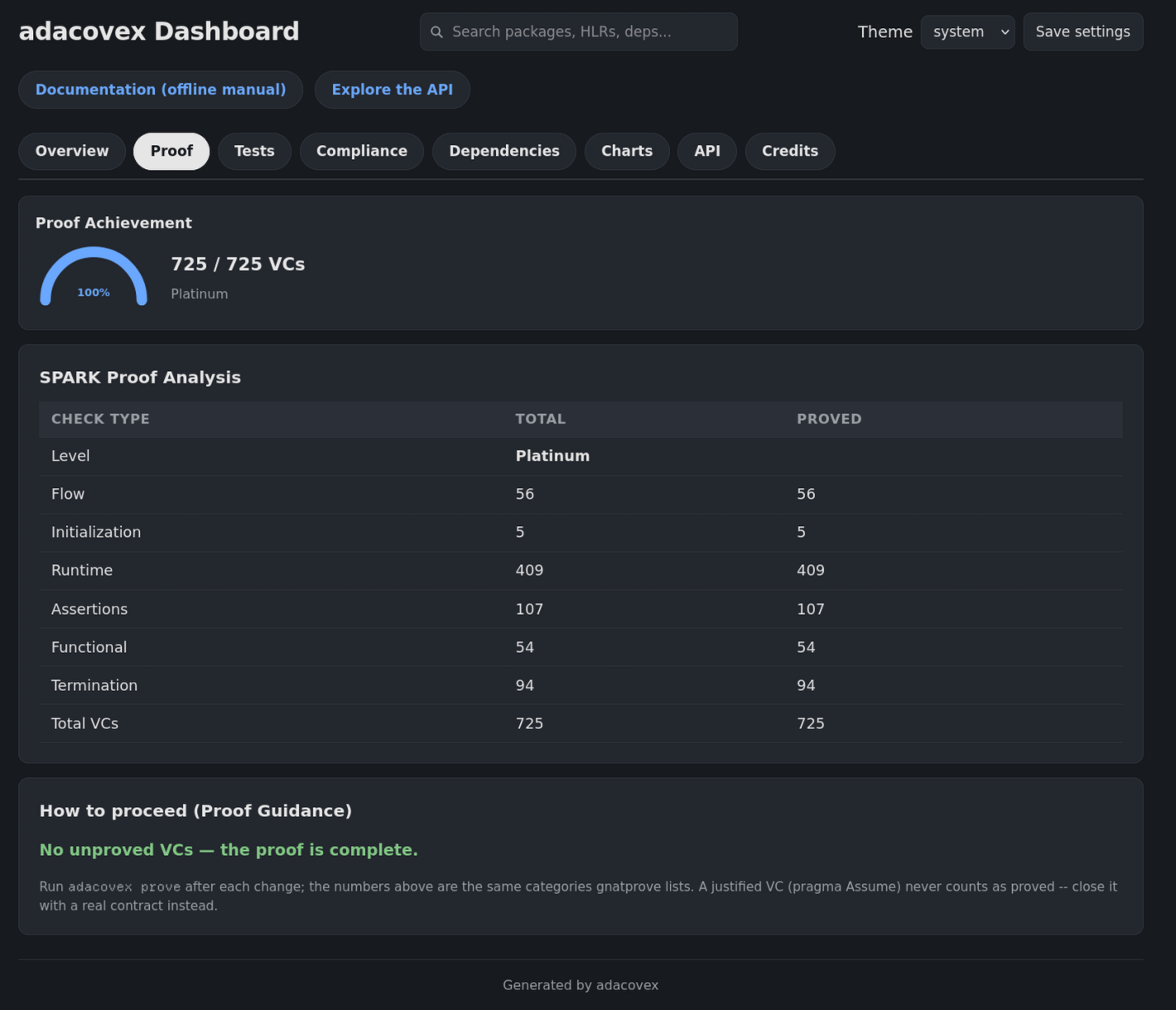
Shows the SPARK level (Stone .. Platinum) and per-category VC counts. The mini VCs proved / total at the top is the headline number. Click into a category to see the breakdown.
If a category is low, that is where the proof effort must focus.
Tests tab
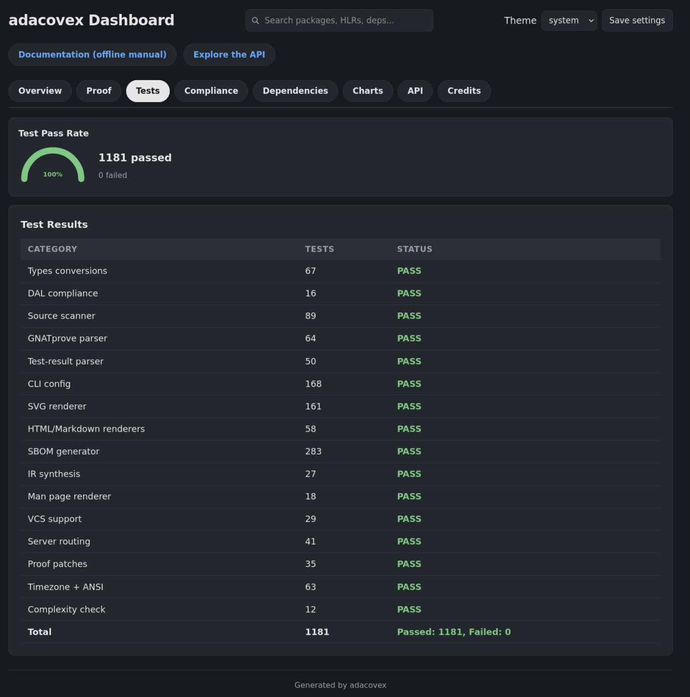
Every test category with its count and Pass / Fail. A single failing category
is enough to fail the compliance gate (Tests passing must be Yes for every
tier except QM / DAL-E).
Compliance tab
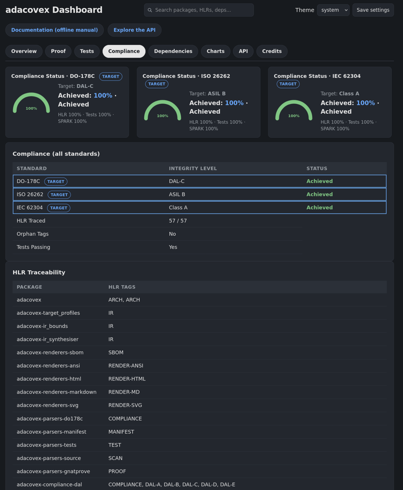
Shows the target integrity level, overall Achieved / Unmet, HLRs traced,
orphan-tag state, and every unmet criterion. Use this to verify that every HLR
is tagged in source and that no tags are orphaned (tagged but not defined in
compliance/HLR.md).
Dependencies tab
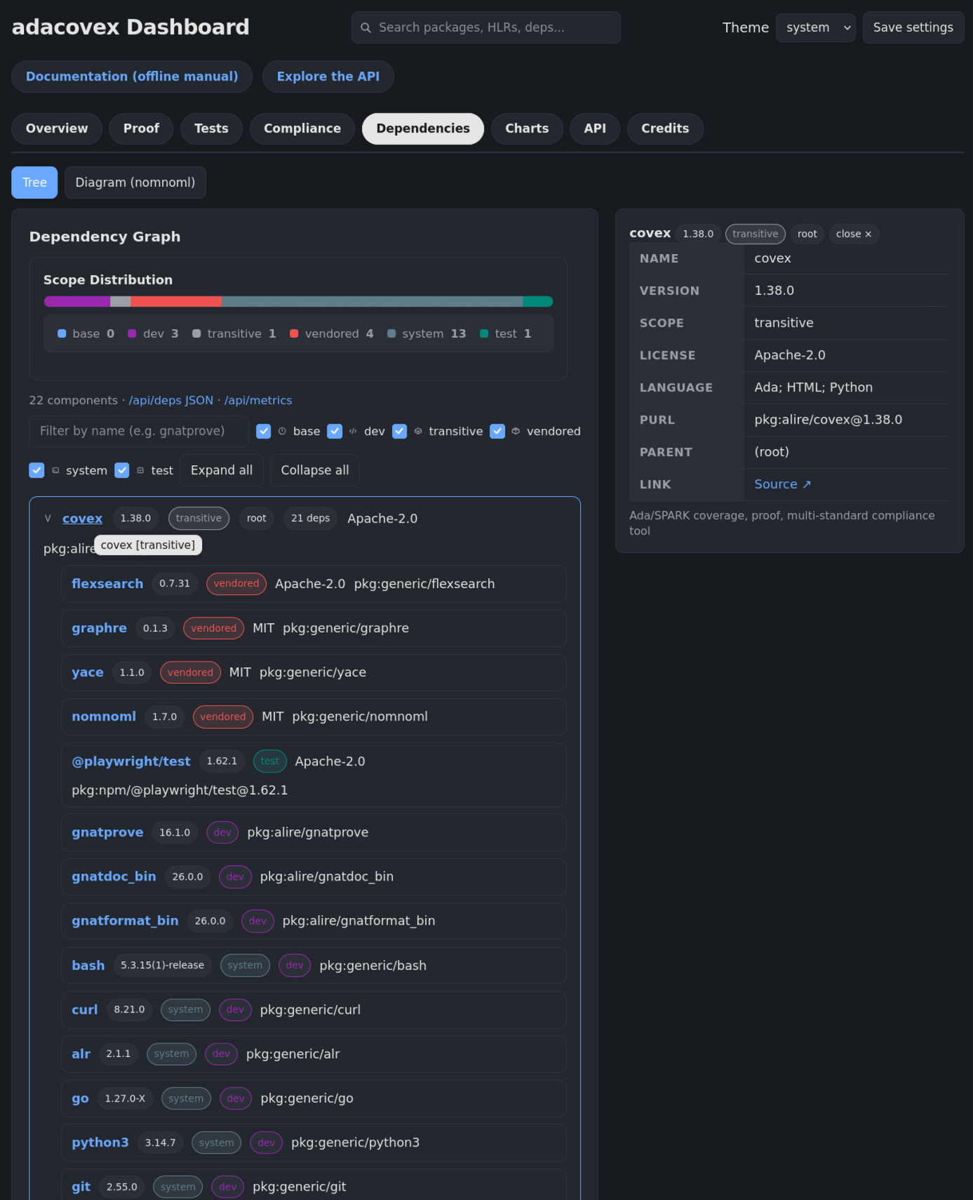
An interactive dependency tree (or diagram) of every component in the graph. Use the filter input and scope checkboxes to focus on base, dev, transitive, vendored, or system dependencies. Click a node to see its licence, PURL, parent, and a registry link. Use this tab to audit your supply chain: confirm every vendored licence is compatible, see which system tools the build needs (the system scope), and trace each component back to its source.
The diagram view (toggle Tree / Diagram) renders the same graph as a directed diagram.
Charts tab
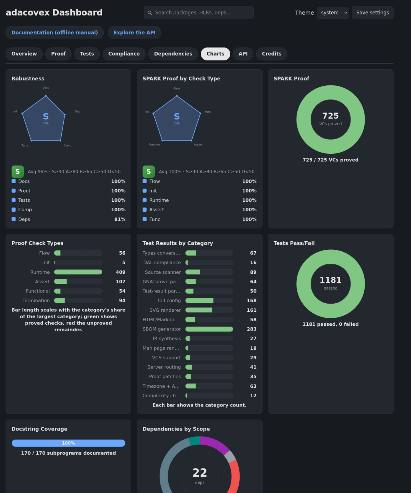
Eight CSS-only cards show the same data as the Overview tab in a different format: the two shared radars (Robustness and SPARK Proof by Check Type), proof and test donuts, proof and test bar charts, the docstring radial gauge, and the dependency scope polar ring. Use this to compare SPARK proof, test results, doc coverage, and dependency scope at a glance. See Metrics charts for the full card-by-card breakdown.
API tab
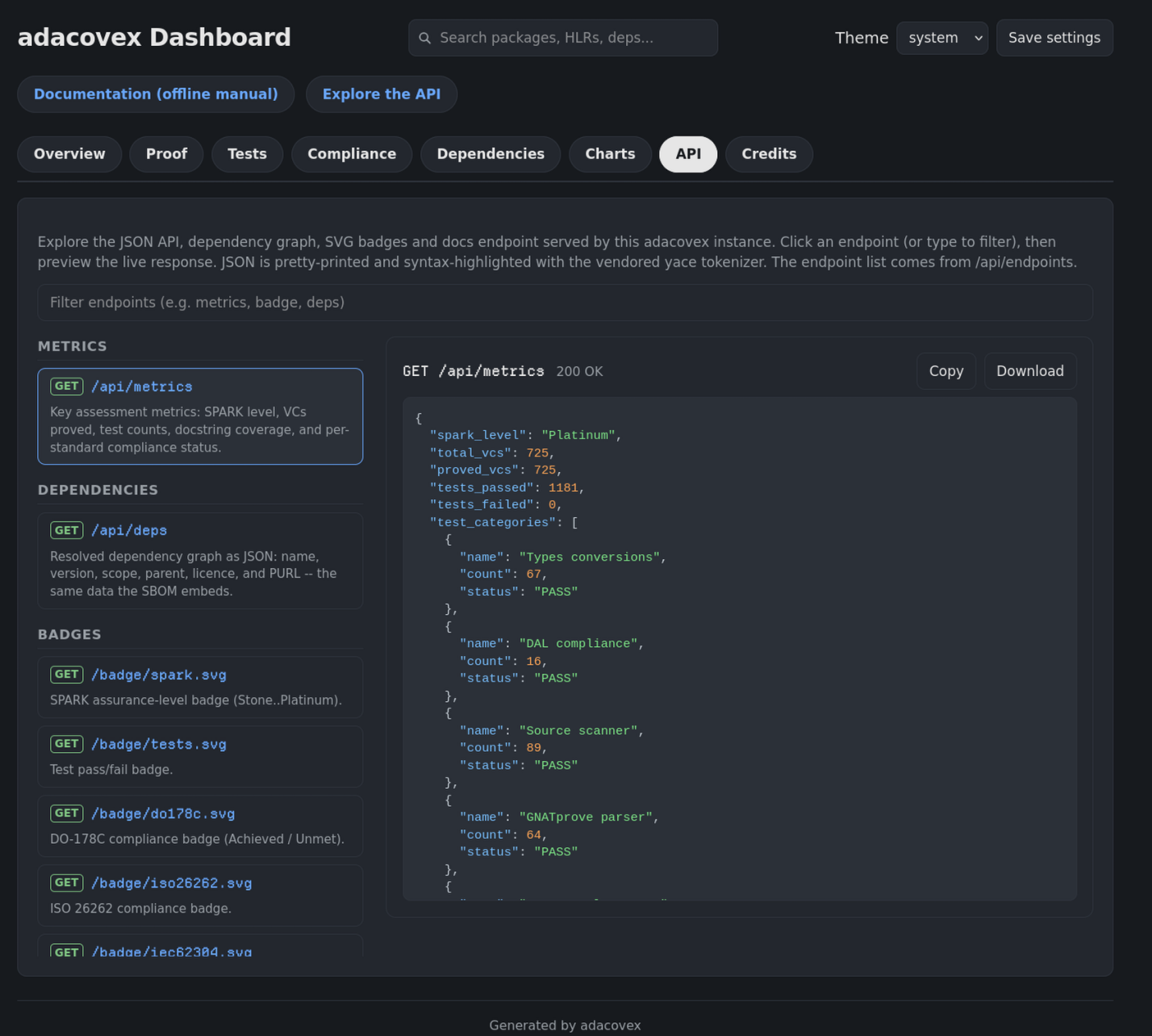
An interactive REST API playground: every endpoint the server dispatches on
as a searchable, clickable button, with a pretty-printed, syntax-highlighted
JSON preview. The first endpoint (/api/metrics) runs automatically, so
the tab opens with a live preview. See API playground
for the full detail.
Interpreting the charts
Green / full arcs – the metric is at 100% or close to it.
Red slices or flat corners – there is a regression or missing data.
Scope rings – a large vendored wedge means strict-mode docstrings are being suppressed by patches. If you see no wedge, vendored code can be uncovered.
Tier letter drops – a drop from
AtoCmeans the average across all five axes fell. Check the axis table to see which one regressed.
The same data is available headlessly at /api/metrics and via
--emit-metrics=PATH ({"metrics":..., "dependencies":...}).
Path |
Content |
|---|---|
|
HTML dashboard (tabbed) |
|
JSON object with the key assessment metrics |
|
JSON dependency graph (same data as the Dependencies tab) |
|
JSON endpoint catalog (the list the API playground builds its UI from) |
|
The bundled offline manual: the Sphinx manual built into the binary (HTML, no external assets) |
|
SPARK assurance level badge |
|
Test pass/fail badge |
|
DO-178C compliance badge (Achieved / Unmet) |
|
ISO 26262 compliance badge |
|
IEC 62304 compliance badge |
anything else |
|
The server runs a small HTTP/1.1 implementation with a 4-worker task pool
(configurable with --serve-workers=N, which is a related flag of
--serve) and serves requests until the process is interrupted (Ctrl-C).
Query strings and URL fragments are stripped before routing, so
/?theme=light, /api/metrics?x=1 and /api/deps#top reach the same
handlers as /, /api/metrics and /api/deps instead of 404ing.
Bundled offline manual
The --serve server also serves the bundled offline manual at /docs
(both spellings, with and without the trailing slash, reach the same page).
The manual is the same Markdown source that powers the Read the Docs site
(docs/, a Sphinx project with docs/conf.py + MyST); at build
time tools/gen-docs.py runs sphinx-build and bundles the resulting site
into the binary (src/adacovex-docs_template.ads) as a lookup table plus
static string constants: every page, stylesheet, script, and badge, keyed
by site-relative path, so the manual is fully self-contained and
navigable offline (each constant stays small – a single multi-megabyte
blob would overflow the gnatprove frontend stack, so the search index is
split into chunks and the server streams them).
Sphinx’s own search machinery (searchindex.js, searchtools.js, the
stemmers) is bundled and the search box works exactly as on the online
site. The PNG screenshots are dropped (they show as notes), the
_sources/ page-source links are stripped, and the bundled HTML stays pure
ASCII (non-ASCII glyphs are encoded as UTF-8 byte values in the Ada
source). Users on a machine without a network connection can still open the
manual from the dashboard – the header Documentation (offline manual)
link and the API playground’s /docs endpoint both point at it.
The HTML dashboard
The page is a single self-contained document (no external assets), bundled
into the binary from modular resources – resources/dashboard.html is
just the page skeleton. Author styles and scripts are split into focused
modules under resources/css/ (dashboard.css, which also styles the
hand-rolled donut rings and bar charts) and resources/js/ (theme.js,
tabs.js, deps.js, details.js, nomnoml.js, search.js, api.js).
The vendored libraries (graphre.js / nomnoml.js / flexsearch.js /
yace.js) sit at resources/, clearly separate from the authored js/
modules so a scan of the tree can tell dependency JavaScript from dashboard
JavaScript at a glance; they are inlined into the template at build time by
tools/gen-dashboard.py, which also minifies the author CSS/JS
(comments and whitespace stripped, vendored files are inlined byte-for-byte
so their tokenizer regexes stay intact).
The resulting adacovex binary - whether a GitHub release artifact or an
Alire crate binary - is completely self-contained. The dashboard has no
external asset references and works offline.
Edit the individual resources/ files, never the
generated src/adacovex-dashboard_template.ads – the template is regenerated
from them at build time and a drift-check fails when it is stale (the
developer guide documents that contributor workflow).
Content is organised into clickable tabs (hash-routed,
keyboard-accessible, persisted in localStorage):
Overview – status badges (live
/badge/*.svgpreview), source overview (packages scanned, subprograms, docstring %), and quick stats (SPARK level, VCs proved, tests, compliance, dependency count), plus the at-a-glance collation charts below the stats: a Robustness radar with a tier rating (S/A/B/C/D from the average of five quality axes), the per-check-type SPARK radar, a tests donut and a doc-coverage radial gauge. The badge row doubles as a preview for the generateddocs/badges/*.svgfiles. See Robustness tier for how the rating is derived.Proof – the SPARK level (Stone..Platinum) and, per check category (flow, initialization, runtime, assertions, functional), total and proved counts plus a mini VCs proved/total column at the top of the tab.
Tests – every test category with count and Pass/Fail plus a mini pass/fail donut at the top of the tab.
Compliance – a mini achievement radial gauge at the top, then the target integrity level and overall
Achieved/Unmetstatus, HLRs traced, orphan-tag state, whether tests pass, each unmet criterion, and the HLR traceability table (package -> tags).Dependencies – a scope-distribution stacked bar at the top, then an interactive dependency tree/graph (see below).
Charts – hand-rolled metrics charts, a strict superset of the Overview charts (it includes the Robustness tier radar and the SPARK proof-by-check-type radar, see below).
API – an interactive REST API playground: every endpoint the server dispatches on as a clickable, searchable button grouped by purpose, with a pretty-printed, yace-syntax-highlighted JSON preview plus Copy and Download actions (see below).
Credits – third-party libraries used by the dashboard (nomnoml, graphre, FlexSearch, yace, Charts.css) with versions, licences, links and the THIRD_PARTY_NOTICES pointer. The Playwright row (e2e test tooling) is labelled
test: the e2e fixture declares@playwright/testunderdevDependencies, and adacovex classifies test-named npm packages (such as@playwright/test) as test dependencies. Charts.css is credited as inspiration – the dashboard charts are adacovex’s own patched version, not the vendored framework.
Tabs are linkable: http://localhost:8080/#deps opens the Dependencies tab
directly (also ?theme=light#proof composes with the theme pin). The active
tab is saved as adacovex-tab in localStorage.
The page footer carries a “Generated by adacovex” line with two obvious
links: Documentation (offline manual) at /docs (the bundled Sphinx
manual) and Explore the API (jumps to the API playground tab). The raw
/api/* URIs are deliberately not listed in the footer – the API playground
is the single place to discover and exercise every endpoint (see
API playground).
Dependencies tab and alternative diagram
The Dependencies tab visualises the resolved alire.toml / alire.lock
graph that also powers the SBOM (/api/deps JSON, sbom.json). The server
resolves the graph at --serve start (best-effort, an unresolvable graph
shows an empty state with a link to /api/deps).
Tree view (default):
Collapsible tree via
<details>(root open, children closed) with improved text spacing (line-height: 1.65,padding: 8px 12px,gap: 10px,margin: 6px 0). Expand all / Collapse all buttons.Filter input (client-side, case-insensitive by name) hides non-matching nodes. Six scope checkboxes (
base,dev,transitive,vendored,system,test– all checked by default) hide whole scopes, so vendored, dev, system, and test deps can be distinguished and filtered where required.Scope badges:
base(alire.toml),dev(alire-dev.toml only),transitive,vendored,system(a tool onPATHthe project references, for examplegitorpython3), andtest(declared under a[[test-depends-on]]section, with-claused only from test project files, declared in a test-labelled section of a supported-language manifest – for exampletestDependenciesin package.json, Cargo’s[dev-dependencies], a Gemfile:testgroup, a Maven test scope, or a pyprojecttestextra – or an npm package whose name starts or ends with “test”, such as@playwright/test).rootbadge for the project itself. Child count badge.data-scopeattribute on each<li>for JS filtering. Scope badge colours come from--scope-base/-dev/-trans/-vend/-system/-testCSS variables so they stay readable in both themes.Each node shows
name,version,license,purlwhen available. The licence and PURL text are colour-coded (--licamber,--purlmuted monospace) so vendored/uncommon licences stand out at a glance.Click a dependency name to open a detail panel in a split view: the tree or diagram stays on the left and the panel docks on the right (it stacks below on narrow screens). The panel is the single source of detail for every dependency and serves both the Tree and the Diagram views. It shows the name, version, scope, licence, language, PURL, parent, and a registry link derived from the PURL (
pkg:github-> GitHub,pkg:gitlab-> GitLab,pkg:bitbucket-> Bitbucket,pkg:npm-> npmjs,pkg:cargo-> crates.io,pkg:pypi-> PyPI,pkg:golang-> pkg.go.dev,pkg:alire-> alire.ada.dev). Ecosystems without a reliable registry get no link rather than a search URL.
A system scope badge marks system-tool dependencies (pkg:generic/* with scope: "system"); their panel adds a note that no external link or licence is provisioned and only the resolved version is shown. Vendored npm/pnpm/cargo packages resolve their licence from the local manifest, or from the package registry (npm view <pkg> license, pnpm show <pkg> license, cargo search <pkg>) when the manifest is silent. Close the panel via the close chip or by clicking another dependency; closing returns the view to full width.
Diagram view (alternative, toggle Tree / Diagram):
Rendered with vendored nomnoml 1.7.0 (MIT,
resources/nomnoml.js, 71 KB, inlined) inside anomnoml-wrapcard.ADACOVEX_GRAPH(__GRAPH_JSON__injected by the Ada renderer) is converted to nomnoml source ([parent]-->[child]edges,#direction: downtop-to-bottom so deep graphs stay within the page width) and laid out with nomnoml’s internal layout engine, then the graph is serialised to an SVG (<svg id="nomnoml-svg">). Every node is a real<g data-name=...>group with a matching<rect>hitbox, so boxes are clickable with exact hit areas (no canvas hit-testing, nothing upside down, no text overflow: node text is clipped to the box width and long labels ellipsise). Diagram colours (fill, background, stroke, line, font) are derived from the page’s CSS custom properties at render time, and the theme select re-renders the diagram, so box/arrow colours always match the active theme. The SVG fills the width allocated to the diagram (it takes up the same space the dependency tree would, rather than shrinking to the graph’s natural size) and is centred horizontally inside.nomnoml-wrap; deep graphs scroll inside the card.
Scope checkboxes filter the diagram too (re-render on change). Buttons Re-render and Download SVG are provided. The view choice is persisted in localStorage (adacovex-dep-view). Click a box to open the same split-view detail panel as the Tree view.
Two separate searches, similar styling:
Global search (header,
#global-search) is a site-wide section index: at page load it walks the rendered DOM and indexes each section – every metric card (labelled by its heading), every compliance-table row, every dependency node, and every HLR-tagged element – plus one catch-all entry per tab. Queries are tokenised and every token must appear in a section’s lowercased text (AND semantics), so multi-word page text such as “orphan tags” or a section heading like “Proof Check Types” resolves regardless of case. Selecting a hit switches to that tab and scrolls to (briefly flashing) the exact section, rather than only switching tabs. Dependency names, versions, scopes, licences and PURLs are indexed too, so the box still filters the dependency tree and seedsdep-filter.Tree filter (
#dep-filter, inside the Dependencies tab) is a plain client-side name filter over the rendered tree only – it never touches the global index. The two inputs share the same styling class so they look consistent, but they are functionally independent (typing in one does not affect the other until a global hit is clicked).
The same data is available headlessly at /api/deps and via
--emit-metrics=PATH ({"metrics":..., "dependencies":...}).
Metrics charts
The Charts tab renders eight cards and is a strict superset of the Overview charts: every chart that appears on the Overview also appears here. The charts are hand-rolled (no vendored chart library): donut rings are a conic gradient with a CSS hole (the same pattern as the polar ring) and bars are flex rows with a fixed label column, so labels never rotate or overflow and the ring colour reflects the covered share (fully green at 100%):
Robustness – the five-axis health radar (Docs, Proof, Tests, Comp, Deps) with the S/A/B/C/D tier rating, the same headline visual as the Overview tab. It is shared with the Overview (one source of truth), so the Charts tab is a superset and the two tabs cannot drift apart.
SPARK Proof by Check Type – the per-category proof radar (Flow, Init, Runtime, Assert, Func) shown on the Overview, also shared.
SPARK Proof – donut of proved vs unproved VCs (
720/720shows a full green ring.680/720shows94%green +6%red unproved).Proof Check Types – bars of proved checks per category (flow, init, runtime, assertions, functional, termination). The green proved fill and red unproved remainder are sized against the largest category (green + red = the category’s share of the biggest), with the grey track showing the scale remainder – so bars scale with magnitude exactly like the test chart. The numbers mirror gnatprove’s own summary table: on gnatprove 16 the Flow category sums the “Data Dependencies” and “Flow Dependencies” rows, and every category’s proved count is Total - Justified - Unproved, so the rows sum exactly to the Total.
Test Results by Category – bars of per-category test counts (normalised to the largest category; long category names ellipsise in the fixed label column instead of overflowing).
Docstring Coverage – radial gauge (half-circle SVG arc) of documented vs total subprograms.
Tests Pass/Fail – donut of passed vs failed tests (fully green when every test passes).
Dependencies by Scope – polar ring of base / dev / transitive / vendored / system / test components (conic-gradient + CSS hole,
--scope-*theme variables) with a legend. Skipped when the graph is empty.
Each card is a different type (radar / radar / donut / bars / bars / radial / donut / polar) so the tab reads at a glance without duplicating a data story. The two radars are shared with the Overview, so the Charts tab contains every Overview chart. No JavaScript is required for the charts (pure CSS/SVG). The radial gauge, the scope ring, and the radars follow the light/dark theme automatically via CSS variables.
The surrounding grid (chart-grid) is responsive and the page container is max-width:1180px so large monitors do not stretch cards. Rings are used where a part-to-whole distribution is the point. Bars are used where a max-normalised comparison across categories is the point.
Robustness tier
The Overview tab leads with a Robustness radar spider and a tier rating
(S / A / B / C / D) so the health of the whole project can be read at a
glance. Five quality axes, each a 0..100 percentage:
Axis |
Meaning |
|---|---|
Docs |
Docstring coverage: documented subprograms / total |
Proof |
SPARK VCs proved / total |
Tests |
Test pass rate: passed / (passed + failed) |
Comp |
Compliance gate: |
Deps |
Dependency hygiene: (graph components - vendored) / total |
The average of the five axes maps to the tier letter:
Tier |
Average |
Colour |
|---|---|---|
S |
>= 90 |
green |
A |
>= 80 |
blue |
B |
>= 65 |
purple |
C |
>= 50 |
orange |
D |
< 50 |
red |
The radar polygon, the per-axis legend with percentages, and the tier chip
are rendered as inline SVG/CSS with integer math (no floating point in the
renderer) and use var(--accent) plus per-tier CSS variables, so they follow
the light/dark theme. Next to it, a small SPARK radar shows the proved
count per check type, also as an inline-SVG spider, and the Tests donut
and Doc Coverage radial gauge give the same pass/fail and coverage
numbers as the full-size charts.
Standard-awareness
Like the sbom subcommand, the dashboard defaults to all standards when
no --standard / --asil / --class flag is given. The status badges and
the compliance card list every standard’s label at the shared tier (DAL-C,
ASIL B, Class A). An explicit standard flag narrows the dashboard to that
single standard (for example --asil=B shows only ISO 26262 at ASIL B). See
Standards for the cross-standard tier mapping.
The JSON API
/api/metrics is a plain HTTP GET, so scripts and CI can consume the
assessment without parsing HTML:
{"spark_level":"Platinum","total_vcs":876,"proved_vcs":876,
 " "tests_passed":1229,"tests_failed":0,"doc_coverage":100,
 "standard":"all","level":"DAL-C","dal_status":"Achieved",
 "standards":{"DO-178C":{"level":"DAL-C","status":"Achieved"},
               "ISO 26262":{"level":"ASIL B","status":"Achieved"},
               "IEC 62304":{"level":"Class A","status":"Achieved"}}}
Field |
Meaning |
|---|---|
|
Assessed SPARK level ( |
|
GNATprove verification-condition counts |
|
Test-result counts |
|
Docstring coverage, 0-100 |
|
|
|
Level label for the top-level target ( |
|
|
|
Per-standard |
/api/deps serves the resolved dependency graph as JSON (the same data the
SBOM embeds, minus the SBOM envelope):
[{"name":"gnat_arm_elf","version":"13.2.1","scope":"dev",
  "parent":"adacovex","kind":"dependency","purl":"pkg:generic/gnat_arm_elf@13.2.1",
  "lang":"","website":"","description":"System tool referenced by the project (dev dependency)"},
 ...]
Field |
Meaning |
|---|---|
|
Component name and version |
|
|
|
Parent component name ( |
|
|
|
Package URL when derivable |
|
Primary language when known |
|
Resolved source URL when known |
|
Short description (for example a system-tool note) when present |
On-disk, the same export is available via --emit-metrics=PATH
({"metrics": {...}, "dependencies": [...]} after any assessment).
API playground
The API tab turns the dashboard into a small interactive REST client. Every route the server dispatches on is listed as a clickable button, grouped by purpose:
Metrics –
GET /api/metrics(JSON).Dependencies –
GET /api/deps(JSON).Badges – each
GET /badge/*.svgendpoint (SVG).Documentation –
GET /docs, the bundled offline manual (HTML).API –
GET /api/endpoints, the endpoint catalog the playground is built from.
The playground uses a split-screen layout: the clickable endpoints,
grouped by purpose, sit in a left-hand nav, and the live response preview
docks on the right – the same pattern as the Dependencies tab’s
tree/diagram + detail panel. On narrow screens the panes stack vertically.
A filter input searches the endpoint nav as you type (matching path,
purpose, and group name), so you can jump straight to metrics or badge.
Clicking an endpoint issues a live fetch against the serving origin and
previews the response:
JSON endpoints are pretty-printed (two-space indent) and syntax-highlighted with the vendored yace tokenizer (
window.YaceTok). A JSON-key rule colours object keys separately from string values, so the payload reads like an IDE view. Endpoint paths that appear inside the JSON payload (for example the/api/...and/badge/...values in/api/endpoints) become clickable links to the live endpoints, and every endpoint button’s path is itself a link that opens the raw URL in a new tab.SVG badge endpoints show the live image above the raw markup.
The
/docsendpoint shows the bundled offline manual (the same page the footer Manual link opens).
A toolbar on the result offers Copy (clipboard) and Download (saves
the raw response body to a file) for the JSON API response, so the
playground doubles as a lightweight HTTP client without leaving the browser.
The first endpoint (/api/metrics) runs automatically so the tab always
opens with a live preview. The endpoint list is not hardcoded in client
JavaScript: the playground fetches it from GET /api/endpoints, the single
source of truth the server declares. Each request is made live against the
instance, so what you preview is exactly what curl returns.
Themes
The dashboard supports light, dark, and system themes. Colours are
driven by CSS custom properties, and a header dropdown switches live between
them. Save settings persists the current selection in localStorage
(no cookies, key adacovex-theme).
Theme resolution on page load:
a
?theme=light|dark|systemquery parameter on the dashboard URL. It always wins. This is the supported way to pin the theme when embedding the dashboard in an iframe. The server strips the query string before routing, sohttp://localhost:8080/?theme=light(and?theme=dark/?theme=system) serves the themed dashboard instead of 404ing.otherwise the explicit CLI theme (
--theme=light/--theme=dark).otherwise the saved
localStoragechoice, if one was saved.otherwise the system theme (
prefers-color-scheme).
--theme only sets the initial selection. The dropdown and Save settings
still override it afterwards in the browser.